Hi Rhys! <img src="
e.deviantart.net/emoticons/h/h…" width="15" height="13" alt="

" data-embed-type="emoticon" data-embed-id="357" title="Heart"/>
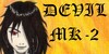
The good stuff!Nice job on the foreshortening (which a lot of people struggle with) and on the clothing. <img src="
e.deviantart.net/emoticons/n/n…" width="15" height="15" alt="

" data-embed-type="emoticon" data-embed-id="334" title="Nod"/> I think on the clothes you've struck a really good balance between realism and the stylized look of comics. You've definitely got the basics down, so at this point I think it's just a few details for you to tweak to get from intermediate to advanced in your illustration.
Here's my advice on things I think you could improve:
The easy stuff: <img src="
e.deviantart.net/emoticons/b/b…" width="10" height="10" alt="

" data-embed-type="emoticon" data-embed-id="211" title="Bullet; Blue"/> I think you could have gone with a few less wrinkles on the shirt & crotch area - what you've got is good, imo, just very slightly more than that "just right" amount. (Yes, I'm giving you the goldilocks treatment here. <img src="
e.deviantart.net/emoticons/w/w…" width="15" height="15" alt="

" data-embed-type="emoticon" data-embed-id="454" title="Wink/Razz"/>) And I'd drop the solid seam line (I think?) down the front of the forward leg.
<img src="
e.deviantart.net/emoticons/b/b…" width="10" height="10" alt="
" data-embed-type="emoticon" data-embed-id="211" title="Bullet; Blue"/> I noticed that you're using tapered strokes on the clothing wrinkles - using those same tapered strokes in the face area imo will give it a more natural feel. Same with the chest area, where the lines look a tad crowded.
<img src="
e.deviantart.net/emoticons/b/b…" width="10" height="10" alt="
" data-embed-type="emoticon" data-embed-id="211" title="Bullet; Blue"/> Shading on the jacket could use a little more contrast. The darker base color imo begs for a darker shadow. Also, the pants seem to be the only part of the piece that didn't get shaded.
<img src="
e.deviantart.net/emoticons/b/b…" width="10" height="10" alt="
" data-embed-type="emoticon" data-embed-id="211" title="Bullet; Blue"/> In keeping with that theme of "less is more" from the first bullet point, slightly less detail in the wings and face (at this distance) I think would help make the face a little more "legible" to the viewer and pop a little more. The little marks under the eye that look like bags for instance, tend to read well in closeups, but not so much in a full-body. On the wings, I've personally found that they work like hair, where you can just outline them and add a few detail strokes here and there to give them a little texture, rather than trying to outline each individual feather (or hair). YMMV.
The slightly harder stuff: <img src="
e.deviantart.net/emoticons/b/b…" width="10" height="10" alt="
" data-embed-type="emoticon" data-embed-id="211" title="Bullet; Blue"/> Hair. You've got the right idea, but hair is really tough. I'd increase the contrast on the shine, and I know he's supposed to have these bangs down in front, but I wouldn't give them any width at this distance, I'd just make them a couple of fine black lines. I think too that the shape of the shine on the hair could be a little smaller -- roughly the same shape, but maybe not quote so long vertically.
<img src="
e.deviantart.net/emoticons/b/b…" width="10" height="10" alt="
" data-embed-type="emoticon" data-embed-id="211" title="Bullet; Blue"/> Foreshortening. I think you've got a good bead on the proportions in the foreshortening - the arms' the right length and the gun looks in-line with the arm - that's all tricky and you've done it beautifully. The next step I think would be to work on making the arm look a little less flat, by rounding the clothing a little more. The wrinkles can be a little rounded, but where it looks the most flat is right at the edge of the jacket's cuff. It's toward the camera at about a 45-degree angle (looks like to me anyway), imo the cuff should be pretty round at that angle.
I hope these suggestions help! <img src="e.deviantart.net/emoticons/b/b…" width="15" height="15" alt="") " data-embed-type="emoticon" data-embed-id="366" title=" (Big Grin)"/>
" data-embed-type="emoticon" data-embed-id="366" title=" (Big Grin)"/> p.s. I created a group a while ago to help me find comic work specifically for critique (it was hard to find comics specifically in the critiqueable feed). That group is here:
<img class="avatar" src="a.deviantart.net/avatars/c/r/c…" alt="

" title="Critoons" />


 created this and I think this is my favourite because he looks so badass!!